
Food & Beverage
Liquid Death
FreeBeverage brand. High-contrast monochrome foundation, giant condensed uppercase headers, product-first hero photography. Loud saturated hero backdrops and metal-gold accents punctuate an otherwise black & white system.
Source · liquiddeath.com
The DESIGN.md
Drop this file into your project and tell your agent to follow it: colors, type, spacing, and the reasoning behind them. A style match, never a pixel copy.
DESIGN.md
---
name: "Liquid Death"
description: "Beverage brand. High-contrast monochrome foundation, giant condensed uppercase headers, product-first hero photography. Loud saturated hero backdrops and metal-gold accents punctuate an otherwise black & white system."
colors:
  primary: "#000000"
  canvas: "#ffffff"
  ink: "#151515"
  ink-muted: "#232323"
  accent-olive: "#8a6d35"
  surface-dark: "#000020"
typography:
  display:
    fontFamily: "\"Acumin Pro\", -apple-system, BlinkMacSystemFont, \"Segoe UI\", Roboto, Oxygen-Sans, Ubuntu, Cantarell, \"Helvetica Neue\", s"
    fontSize: "2.5rem"
    fontWeight: "700"
    lineHeight: "1"
  section-eyebrow:
    fontFamily: "\"Acumin Pro\", -apple-system, BlinkMacSystemFont, \"Segoe UI\", Roboto, Oxygen-Sans, Ubuntu, Cantarell, \"Helvetica Neue\", s"
    fontSize: "1.5rem"
    fontWeight: "700"
    lineHeight: "1"
    textTransform: "uppercase"
  subdisplay:
    fontFamily: "\"Acumin Pro\", -apple-system, BlinkMacSystemFont, \"Segoe UI\", Roboto, Oxygen-Sans, Ubuntu, Cantarell, \"Helvetica Neue\", s"
    fontSize: "2rem"
    fontWeight: "400"
    lineHeight: "1"
  product-title:
    fontFamily: "\"Acumin Pro\", -apple-system, BlinkMacSystemFont, \"Segoe UI\", Roboto, Oxygen-Sans, Ubuntu, Cantarell, \"Helvetica Neue\", s"
    fontSize: "1rem"
    fontWeight: "500"
    lineHeight: "1.13"
  body:
    fontFamily: "\"Acumin Pro\", -apple-system, BlinkMacSystemFont, \"Segoe UI\", Roboto, Oxygen-Sans, Ubuntu, Cantarell, \"Helvetica Neue\", s"
    fontSize: "1rem"
    fontWeight: "400"
    lineHeight: "1"
  call-to-action:
    fontFamily: "\"Acumin Pro\", -apple-system, BlinkMacSystemFont, \"Segoe UI\", Roboto, Oxygen-Sans, Ubuntu, Cantarell, \"Helvetica Neue\", s"
    fontSize: "1rem"
    fontWeight: "700"
    lineHeight: "1.5"
    letterSpacing: "0.063em"
    textTransform: "uppercase"
rounded:
  xs: "5px"
  full: "9999px"
spacing:
  xs: "8px"
  sm: "12px"
  md: "14px"
  lg: "16px"
  xl: "24px"
  2xl: "28px"
  3xl: "32px"
  4xl: "36px"
containerMaxWidth: "1312px"
---

> Reverse-engineered from a live Chrome session on [https://liquiddeath.com](https://liquiddeath.com) — computed styles, DOM inspection, and pixel sampling. Values are **measured, not estimated**, unless flagged.

## Overview

Liquid Death’s visual language is a two-note system: a strict black & white typographic engine and explosive product photography that carries all the color and attitude. The site uses a single grotesque/gothic brand voice set in a condensed, heavy sans display (measured font stack: "Acumin Pro", -apple-system, BlinkMacSystemFont, "Segoe UI", Roboto, Oxygen-Sans, Ubuntu, Cantarell, "Helvetica Neue", s) to produce huge, shouted headlines and terse labels. That typographic clarity keeps layout predictable and lets the product imagery — cans, metallic details and saturated backdrops — do the brand storytelling.

Why it works: the restrained chrome (black/white/near-black) creates an advertising billboard where product photographs read like posters. The site intentionally minimizes decorative UI: blocks are plain, radii are square, shadows are rare and accents are limited to a single olive/gold tone (#8a6d35). The navigation is stripped-down and the page rhythm alternates high-impact hero bands with wide white sections for product grids and editorial content.

Signature artwork/graphic motif: the site repeatedly uses close-up product photography — glossy cans with metallic gold printing and water droplets — placed over full-bleed saturated backdrops. In screenshots you’ll also see large noisy environmental photos (plastic recycling imagery) used full-bleed. Exact hero backdrop saturations in those screenshots are not measured; measured image cluster colors captured from the hero art are darker clusters such as #000020 and #002020, indicating deep, moody image pixels sampled at 48px.

**Key characteristics**
- Black-and-white first: primary UI uses #000000 and #ffffff with near-black text #151515 for display.
- Huge condensed uppercase headlines (h2 measured at 40px / 700) that read like ad copy.
- Product imagery is the only place color gets loud — photography-driven color hierarchy.
- Single gold/olive accent (#8a6d35) used sparingly for links and decorative highlights.
- Square geometry: borderRadius values are 0px or small (measured radii include 5px and pill) — minimal softening.
- Minimal elevation: one measured shadow style only (rgba(0, 0, 0, 0.15) 0px 4px 12px 0px).

*A style reference measured from [https://liquiddeath.com](https://liquiddeath.com) — never a pixel copy.*

## Colors

### Palette (by role)
| Token | Value | Usage |
|---|---|---|
| primary | #000000 | Primary UI fills, CTA solid buttons, large dark bands and card backgrounds. |
| canvas | #ffffff | Page canvas and most section backgrounds; the site primarily reads on #ffffff. |
| ink | #151515 | Primary headline text color (used on h2 elements and large display type). |
| ink-muted | #232323 | Secondary/paragraph text and smaller chrome labels where a softer black is required. |
| accent-olive | #8a6d35 | Link color and occasional gold/olive accent on chrome details. |
| surface-dark | #000020 | Dark image backgrounds and heavy hero art clusters (used behind badges and seal art). |

### Surfaces (measured, area-weighted)
| Background | Weight |
|---|---|
| #f5f5f5 | ×411 |
| #ffffff | ×362 |
| #000000 | ×133 |
| rgba(255, 255, 255, 0) | ×71 |
| #e9e6e3 | ×21 |
| #040404 | ×1 |
| #e6e6e6 | ×1 |

### Ink (measured text colors)
| Color | Elements |
|---|---|
| #151515 | ×56 |
| #000000 | ×53 |
| #ffffff | ×10 |
| #232323 | ×9 |
| #8a6d35 | ×4 |
| #121212 | ×4 |
| #747474 | ×1 |

### Hairlines & borders
| Color | Elements |
|---|---|
| #ffffff | ×7 |
| #000000 | ×3 |
| #999999 | ×1 |
| #151515 | ×1 |

### Gradients (computed, exact stops)
- `linear-gradient(244.79deg, rgba(0, 0, 0, 0) 0%, rgba(0, 0, 0, 0) 100%)`

### Signature artwork (image)
dominant pixel clusters of the hero image, sampled at 48px.
| Cluster | Frequency |
|---|---|
| #000020 | ×214 |
| #000000 | ×175 |
| #002020 | ×174 |
| #202040 | ×98 |
| #404060 | ×53 |
| #204060 | ×48 |
| #406080 | ×47 |
| #202020 | ×41 |

### The site's own tokens (CSS custom properties)
| Variable | Computed value |
|---|---|
| `--swiper-theme-color` | #007aff |
| `--swiper-navigation-size` | 44px |
| `--kl-reviews-color-light-gray` | #e9e9eb |

Use and hierarchy (measured values):

- Primary black (#000000): use as the dominant UI color — solid CTAs, heavy bands, footer backgrounds and primary button fills. This color is prevalent in measured backgrounds and button recipes.
- Canvas white (#ffffff): page canvas and most section backgrounds; measured as the second-most-used background value (#ffffff) and used in the footer and product grid backgrounds.
- Display ink (#151515): headline ink (measured in typeScale for selector "h2" with color "#151515"). Use for major typographic statements where pure black would feel too flat against imagery.
- Muted ink (#232323): paragraph and secondary text when you need softer emphasis than the display ink (measured under textColors as "#232323").
- Accent olive (#8a6d35): measured in textColors; reserve for links and the occasional metallic/gold hint. Use sparingly for emphasis only.
- Surface-dark (#000020): measured in heroArt colors — used for deep image clusters and dark art regions.

If a color you want to use is not listed here, mark it as not measured and restrict usage to imagery only; the UI system relies on the measured black/white/olive palette for brand consistency.

## Typography

### Families (computed)
| Stack | Headings | Body | Chrome |
|---|---|---|---|
| "Acumin Pro", -apple-system, BlinkMacSystemFont, "Segoe UI", Roboto, Oxygen-Sans, Ubuntu, Cantarell, "Helvetica Neue", s | ×40 | ×294 | ×13 |
| "Acumin Pro", sans-serif | ×0 | ×20 | ×0 |

### Type scale (measured)
| Token | Size | Weight | Line-height | Letter-spacing | Case | Family | Role |
|---|---|---|---|---|---|---|---|
| display | 40px (2.5rem) | 700 | 40px (1) | 0 | — | Acumin Pro | Primary large headline voice for hero and section titles (use for statements like 'MURDER YOUR THIRST'). |
| section-eyebrow | 24px (1.5rem) | 700 | 24px (1) | 0 | uppercase | Acumin Pro | Uppercase small section headings and nav-ish labels (tight line-height, used for compact uppercase headings). |
| subdisplay | 32px (2rem) | 400 | 32px (1) | 0 | — | Acumin Pro | Secondary big title when a slightly smaller, regular-weight headline is needed. |
| product-title | 16px (1rem) | 500 | 18px (1.13) | 0 | — | Acumin Pro | Product titles and medium-weight labels in catalog listings. |
| body | 16px (1rem) | 400 | 16px (1) | 0 | — | Acumin Pro | Body copy for descriptions and paragraph text across pages. |
| call-to-action | 16px (1rem) | 700 | 24px (1.5) | 1px (≈0.063em) | uppercase | Acumin Pro | Small-to-medium CTAs and button labels; strong uppercase voice used for buttons like 'SHOP NOW' and nav actions. |

Measured type voices and how to use them:

- h2 (selector "h2"): fontFamily "\"Acumin Pro\", -apple-system, BlinkMacSystemFont, \"Segoe UI\", Roboto, Oxygen-Sans, Ubuntu, Cantarell, \"Helvetica Neue\", s", fontSizePx 40, fontWeight 700, lineHeightPx 40, color "#151515". Use this for hero headlines and main section titles. Always prefer uppercase or large caps-style presentation for maximum impact.
- h3 (selector "h3"): fontSizePx 24, fontWeight 700, lineHeightPx 24, textTransform "uppercase", color "#151515". Use for eyebrow labels and small uppercase sections or nav items.
- h4 (selector "h4"): fontSizePx 32, fontWeight 400, lineHeightPx 32, color "#000000". Use when you need a regular-weight large title that’s less aggressive than h2.
- h5 (selector "h5"): fontSizePx 16, fontWeight 500, lineHeightPx 18, color "#151515". Use for product names in context where a medium weight is needed.
- p (selector "p"): fontSizePx 16, fontWeight 400, lineHeightPx 16, color "#000000". Use for body copy and product descriptions; keep paragraphs short and left-aligned.
- uppercase-label (selector "uppercase-label"): fontSizePx 16, fontWeight 700, lineHeightPx 24, letterSpacingPx 1, textTransform "uppercase", color "#ffffff". This measured role is used for CTA labels and button text; maintain letter-spacing and uppercase to preserve the brand voice.

Font stack (measured): prefer "Acumin Pro" fallback to system stacks exactly as measured in fontFamilies. Do not replace with a rounded or humanist display — the brand depends on a stark condensed voice.

## Layout

- Container max-widths (measured): 1312px (×4), 870px (×2).
- Spacing steps in use (section paddings + flex/grid gaps): 12px (×20), 32px (×7), 16px (×2), 24px (×2), 14px (×2), 8px (×1), 36px (×1), 28px (×1).
- Page height at 1440px viewport: 3770px.

Measured layout tokens and how to apply them:

- Spacing: concrete spacing steps measured include 12px, 32px, 16px, 24px, 14px, 8px, 36px, 28px. Use these exact steps to maintain rhythm (for example: small gaps 12px, card padding 16px, section padding 32px).
- Containers: measured containerMaxWidths include 1312px and 870px. Use 1312px for wide product and content pages; use 870px for constrained content areas or mobile-breakpoint content columns.
- Nav: measured nav height is 64px (nav object: heightPx 64). Keep nav compact and minimal; measured nav background is "rgba(0, 0, 0, 0)" (transparent) and boxShadow "none".
- Bands/surface rhythm: the measurements include a band with background "#ffffff" and heightPx 3770 — the site relies on alternating full-bleed image or colored hero bands and large white sections for breathing room.

Follow measured spacing steps exactly when building grids and gaps so the overall vertical rhythm matches the reference.

## Elevation & Depth

### Shadows in use (measured)
| Box-shadow | Elements |
|---|---|
| `rgba(0, 0, 0, 0.15) 0px 4px 12px 0px` | ×1 |

Measured elevation tokens and edge treatments:

- Shadows: only one measured shadow is used site-wide — "rgba(0, 0, 0, 0.15) 0px 4px 12px 0px". Use sparingly (callouts, raised product cards) and avoid layering multiple shadows.
- Radii: measured radii include "5px" and "pill". Many site components are square (0px borders measured in buttons and inputs). Prefer 0px for primary UI, reserve 5px for small chips or subtle rounding, and pill for badges when necessary.

The brand skews flat — avoid heavy depth, rely on contrast and scale instead.

## Shapes

Border-radius scale, from computed values across the DOM:
| Radius | Elements |
|---|---|
| 5px | ×9 |
| pill | ×3 |

## Components

### Buttons (measured variants)
| Background | Text | Border | Radius | Padding | Type | Case | Seen |
|---|---|---|---|---|---|---|---|
| rgba(0, 0, 0, 0) | #000000 | none | 0px | 0px | 16px/700 Acumin Pro | uppercase | ×8 |
| #000000 | #ffffff | 2px solid #ffffff | 0px | 24px 40px | 32px/700 Acumin Pro | — | ×2 |
| #000000 | #ffffff | none | 0px | 8px 16px | 16px/400 Acumin Pro | — | ×1 |
| #000000 | #ffffff | 1px solid #000000 | 0px | 16px 40px | 16px/700 Acumin Pro | uppercase | ×1 |
| rgba(0, 0, 0, 0) | #000000 | 1px solid #000000 | 0px | 16px 40px | 16px/400 Acumin Pro | — | ×1 |
| #040404 | #ffffff | none | 0px | 10px 15px | 16px/400 Acumin Pro | — | ×1 |

### Inputs
| Background | Text | Border | Radius | Padding | Type | Case | Seen |
|---|---|---|---|---|---|---|---|
| #ffffff | #000000 | 1px solid #999999 | 0px | 8px 12px | 16px/400 Acumin Pro | — | ×1 |

### Navigation
Position `absolute`, painted surface `rgba(0, 0, 0, 0)`, height 64px, radius `0px`, shadow `none`.

### Footer
Surface `#ffffff`, text `#000000`.

### In-copy links
Color `#8a6d35`, decoration `underline`.

- Buttons (measured recipes):
  - Outline / transparent CTA: background "rgba(0, 0, 0, 0)", color "#000000", border "none", borderRadius "0px", boxShadow "none", fontSizePx 16, fontWeight 700, letterSpacingPx 1, textTransform "uppercase". Use for subtle CTAs on white canvas.
  - Heavy CTA: background "#000000", color "#ffffff", border "2px solid #ffffff", borderRadius "0px", padding "24px 40px", fontSizePx 32, fontWeight 700. Use sparingly for hero-level CTAs.
  - Small solid: background "#040404", color "#ffffff", border "none", padding "10px 15px", fontSizePx 16, fontWeight 400. Use for small icon CTAs or compact actions.
  - Keep measured borders and radii exactly as listed in the button recipes when creating variants.

- Inputs (measured): background "#ffffff", color "#000000", border "1px solid #999999", borderRadius "0px", padding "8px 12px", fontSizePx 16. Use for forms and email sign up. Keep placeholder text subtle and left-aligned.

- Nav (measured): position "absolute", background "rgba(0, 0, 0, 0)", heightPx 64, boxShadow "none", borderRadius "0px". Keep the nav visually lightweight and let hero imagery show through beneath it.

- Footer (measured): background "#ffffff", textColor "#000000". Footer uses the same white canvas and black text pairing; links are accent colored (#8a6d35 measured under textColors).

- Links (measured): color "#8a6d35", textDecoration "underline". Use this olive/gold for inline links only; buttons and CTAs should use the black/white system.

- Hero art (measured): heroArt dominant measured pixel clusters include "#000020", "#000000", "#002020", "#202040" — hero imagery can be deep and moody in the measured sample. Note: large saturated backdrops seen in screenshots (magenta/green) are not present in the measured color list and are therefore marked as not measured for exact hex values.

## Do's and Don'ts

- **Do:** use the measured font stack exactly: "Acumin Pro", -apple-system, BlinkMacSystemFont, "Segoe UI", Roboto, Oxygen-Sans, Ubuntu, Cantarell, "Helvetica Neue", s.
- **Do:** use h2 as the primary display voice (selector "h2" — fontSizePx 40 / fontWeight 700 / color "#151515") for hero and section titles.
- **Do:** keep UI mostly black (#000000) and white (#ffffff); reserve #8a6d35 for links and highlights.
- **Do:** follow the measured spacing steps (12px / 16px / 24px / 32px) to keep consistent rhythm.
- **Do:** keep button geometry square (borderRadius "0px") for primary CTAs and match measured padding & weights.
- **Do:** rely on product photography and full-bleed imagery to carry color and personality — treat images as the brand’s color system.
- **Don't:** introduce soft rounded corners across primary chrome (avoid using large radii where measurements show 0px or small 5px).
- **Don't:** layer heavy shadows — the only measured shadow is "rgba(0, 0, 0, 0.15) 0px 4px 12px 0px" and it should be used sparingly.
- **Don't:** replace "Acumin Pro" with a casual or script font; the condensed, strong sans is core to voice.
- **Don't:** introduce multiple accent colors in UI — the measured accent is #8a6d35 and additional accents would break the restrained chrome.
- **Don't:** use thin or light type for hero headlines; measurements show heavy weights (700) and tight line-heights for display.
Measured from the live site
The full-page capture this DESIGN.md was measured from. Values in the file are computed from a real session, not estimated.
liquiddeath.com
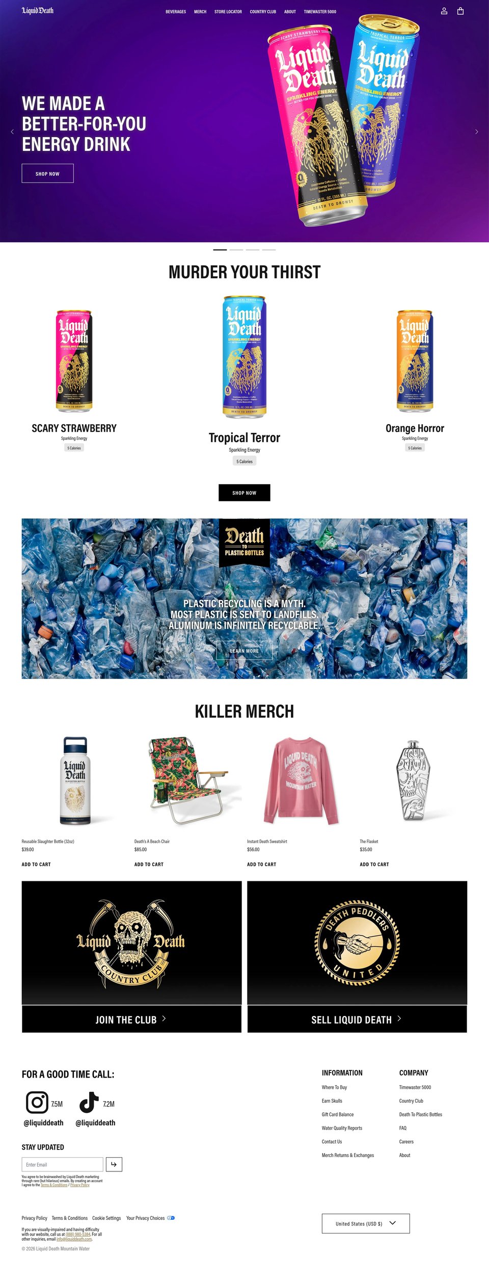
A design reference from liquiddeath.com, a public website: patterns, never its code or assets. Own this site? Request removal.